Showing posts with label photos. Show all posts

Sunday, 23 June 2024

Behold the art

Sometimes I just want to write a post on this blog to mark something that made me happy. This is one of those, so feel free to tune out if you're looking for something something data technology management leadership.

Anyone left? Cool.

For reasons that escape me, I was asked to show some of my photographs at a local exhibition of creativity and art. I have been a keen photographer for many years, but I've never really thought my pictures rise to any kind of display standard. However, others did not share that opinion so I was pushed into creating a display.

It went well!

My photos at the St Swithins art exhibition 2024

And my photos of the whole event are here.

I actually got some really good comments. People loved the theme coming through the writeup and apparently some people got quite emotional when I wasn't there. In addition to the disease itself, the COVID lockdown has left some deep wounds and it does seem weird to me that, unlike other national emergencies (eg the war) we don't really talk about it much. Some of life has changed, some of life has reverted to as it was before. But in the main we're just carrying on. Certainly in my head unless I properly think about it, lockdown was ages ago now and something that happened over a couple of weeks. Clearly, that is absolutely not true, and I find it weird how keen we are collectively to put it to the side. Perhaps this is our way of collectively dealing with the trauma? It seems we should have a national memorial day or something?

Anyway, before this becomes a post about lockdown or COVID, just a few notes on how this was pulled together.

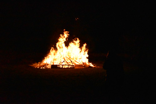
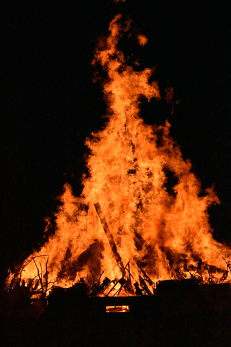
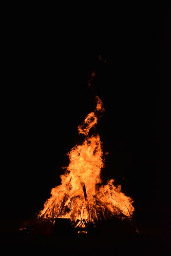
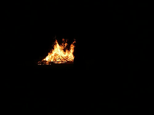
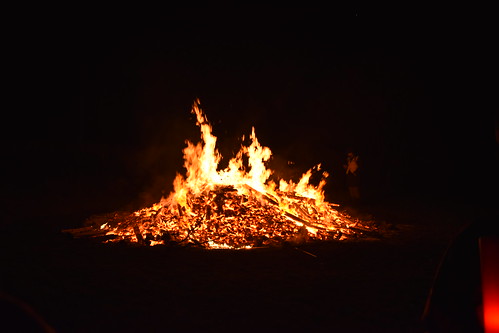
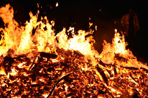
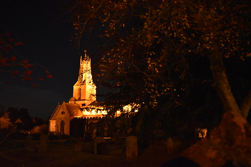
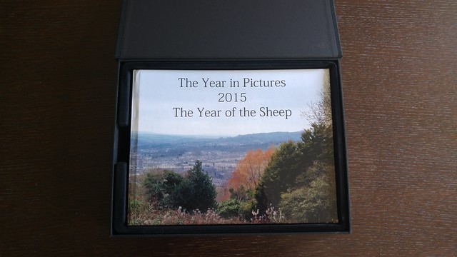
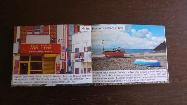
Obviously, the photos were taken years ago. They were part of a wider set (which was on the projector above, and is in the embedded carousel below) depicting light in the darkness of those times. This set is also on Flickr and that creates a slideshow which could be put up on screen. These pics were made into a book years ago, so I got one of the owners of that book (my parents) to pick their favourites and, after a spot of measuring and checking the DPI I calculated they would work at A3 size. Sadly, the local print store has shut down so after a spot of Googling, I took my flash drive to Ryman and was very pleasantly surprised that their photo printing is (to my amateur eye at least) really very good. If you are in Bath and need something printed well, you can do a lot worse!

One Flickr link, six pictures and a short write up combined to what you see above. I was really quite pleased with the outcome and makes me think I would like to do a bit more of this kind of thing. Of course that means I need to do some more creative work.

Since this blog is usually about the tech industry - I also met someone who is a developer looking at their future in the industry and gave them some sage advice (lol). Seriously, no idea if I said anything valuable or not, but I am always open to opportunities to help those coming through and give back. In fact, there is a post on this coming soon...

And to sign off - here is the full set of images from the display.

Light book - lockdown

Thursday, 30 November 2017

Remember remember

Let's talk about fire.

I've always loved bonfires. They are primal and evocative - beautiful pillars of light and movement shining bright in darkness. So what does that mean for photography? Taking a picture of a bonfire is both an interesting technical challenge and an exercise in trying to capture the emotion of the moment.

Breaking down the requirements in photographic terms, what do we have? The fire is moving so you need a fast shutter speed to capture the tongues of flame. The scene is dark, but with a bright light source so you need to control white balance. A fast shutter means a higher ISO, to make the camera more responsive to the available light. A wider aperture allows more light in, but also restricts the telephoto options. So a first guess leads to something like:

  • High shutter speed
  • High ISO
  • Wide aperture

So something like this:

Minch fireworks

Nice and warm, but the body of the fire is over-exposed.

What happens if we drop close the aperture and rely on a crazy-high ISO to capture the available light?

Minch fireworks

Loses the warmth, but now we can see into the body of the fire.

I wonder how important the ISO is in practice? What is we keep a wide aperture and fast shutter and drop the ISO?

Minch fireworks

There is more definition on the tongues of flame here when we zoom right in. Pushing the ISO distorts the image so this is a good change.

I started taking these pictures trying to logically get to some decent manual settings. Out of interest I brought out my phone and took a photo then looked at the results:

Minch bonfire

Huh. Seems nice. Settings?

  • Medium shutter speed
  • Tiny ISO
  • Wide aperture

So the phone decided aperture was the key to sorting out the light capture, and didn't think the movement of the fire was too much of a big deal. Next step was to try this collection of settings on my big camera:

Minch fireworks

Different again. More warmth, losing definition on the tongues of flame.

And for a last hurrah, how about a different framing - adding some zoom (which narrows the aperture) and correcting a bit with ISO and shutter:

Minch fireworks

I have my favourites. It's very interesting seeing the same fire depicted so differently just by fiddling with some settings. I'm still calibrating my mind - looking at the subject and trying to imagine the different photos possible with different settings. The first few here I can say I thought through logically but I'm not sure I'd have got to the settings chosen by the automatic mode on my phone. I suppose I'll have to go to more bonfires and keep practising. Such a shame.

All the photographs taken that evening, including some different attempts at fireworks, are in this album:

Minch bonfire 2017

Saturday, 21 October 2017

Getting off auto

I take a decent number of photographs and as well as running a monthly photograph website I am taking it increasingly seriously as a hobby. Most of my photographs are taken using a camera phone thanks to the convenience of it always being in my pocket and, although I've dabbled with manual settings and know (very roughly) what they do I've never really been able to get consistently decent shots on manual mode. Never one to have a hobby and not get nerdy about the details, this month I got myself a proper camera and went with my Dad on a course to learn how to get off auto.

Buying a camera is hard. There are a load of nearly identical models and so much comes down to personal preference at a time when one doesn't know enough to have a preference. Given how expensive lenses can be, this is also a decision about which ecosystem to buy in to. It's a similar lock-in to the Apple / Windows or iOS / Android world in that it's reversible, but change can be tricky, unfamiliar and expensive. I may write about this in the future, but for the moment my key learning was the big choice if buying an SLR is Nikon / Canon. I ended up choosing a Nikon 5600.

Not all the way off auto


I've played around with manual photography before and have a (very) basic understanding of what the various settings do. When switching to manual mode on the phones I've used, the interface has encouraged taking full control - that is handling aperture, shutter speed, ISO and white balance all at once. This has always been too many interconnected, unfamiliar settings to learn and embrace at the same time. Possibly the single most useful tip from this course was to view it differently - take control of one of these aspects and let the camera do most of the rest automatically. This gives priority to a particular setting and therefore set of techniques (indeed, the modes on a proper camera are called aperture or shutter priority so ... yeah).

Aperture


We focused on aperture, letting the camera adjust shutter speed automatically and making corrections for exposure with the ISO setting. A wider aperture (aka a smaller f stop setting) lets in more light, allowing a faster shutter speed. It also allows control of the depth of field, enabling the blurred background effect used to create useful negative space and draw attention to a specific area of a picture.

This is often seen in portraits. Some useful tips for portraits - the eyes are the most important bit and should therefore be in the sharpest focus. So far, fairly obvious. Less obvious is that the camera may well actually focus on the closest part of the face - the tip of the nose - so for a really good picture some manual adjustment is necessary.

Another counter-intuitive tip is that portrait pictures are best taken on maximum zoom or with a dedicated telephoto lens. This is because the longer focal length allows for a wider aperture and hence maximises the depth of field effect.

Results?


And lo, the results.

Or, for a particular example of the portrait stuff above:

Portrait
We had a lot of fun walking around Lacock and practising the specific techniques that fell out of playing with this one setting and the day did a wonderful job of demystifying the bewildering array of buttons on a decent camera. I'm looking forward to learning more.

Saturday, 30 July 2016

Printing a photo book

TL;DR - I used CEWE Photoworld and it was good

I have been running a photography website since the start of 2015 and I thought it would be nice to turn the pictures from last year into some kind of coffee table photo book. That's 72 photographs (12 months x 6 photographers) each with title and caption, plus each month needed a cover page, and I wanted the first photo of each month to appear on the right-hand page so I needed another page per month to shuffle the photos on. That's 8 pages per month, for a total of 96 pages to lay out - not a small amount of work so I needed a site which would give me a tool which I could use without wanting to do Very Bad Things by the end of it.

Photoworld


After some searching I ended up using CEWE Photoworld for three important reasons:

  • They have a desktop tool
  • They have an online help which actually ... helps
  • They have a 100% satisfaction guarantee

The desktop tool is hardly the pinnacle of software design, but it does the job. It is quick, reassuringly responsive and allows text with background colour and limited bulk formatting. It let me put everything together in the way I wanted, including guidelines on where I could push content to the edge of pages and where it wouldn't work. This put it a huge step forwards from Photobox, which I tried first because it is the famous one. Photobox offers a web based application which didn't let me add text with a coloured background and generally had that cumbersome feeling of web applications from last decade.

The Photoworld online help includes a real time chat, which was very helpful. I used it twice. The first agent was very responsive and helpful, answering my questions and generally being very reassuring. The second one was significantly less so - I got the impression he had far too many simultaneous conversations running, and was annoyingly vague when I was asking very precise questions (if you've got five different types of paper to choose from then you really can't use terminology which ambiguously covers three of them when recommending a choice). Still, we got there and the site helpfully emailed me a copy of the conversation which I kept just in case I needed to trigger the guarantee at a later date. Fortunately I've not had to test their guarantee in practice, but it was very reassuring to know that I had that safety net.

Reassuring is, I think, the key word for describing dealing with Photoworld. They know their service is expensive (as in book printing is expensive - I don't think they are expensive compared to their competitors) and is likely to be bought by people who haven't got a clue what they are doing so they do their utmost to make you feel like you're in good hands, and minimise the chances you're going to make a mess of what you're doing. One example from the site text - each book passes through 15+ pairs of hands as it is produced so it is thoroughly checked for imperfections. Regardless of how helpful this actually is in reality, it is an encouraging thought.

The only time I feared for my book while using it was when it came to finish and pay. At this point it uploads the pictures and send you off to secure payment, or crashes horribly if you attempt to use the Paypal option. This is slightly frightening when you've spent tens of hours laying everything out and proofing the book and all of a sudden it looks like it might be stuck on your desktop for all of eternity. Anyway, a switch to using a credit card bypassed that part of the application and it all worked fine.

Behold


The book arrived slightly quicker than promised and looks great.

Year in Pictures 2015

The presentational box was an extra, but looks really nice.

Year in Pictures 2015

And the photos printed well. There is a notable variance in the quality of the pictures between the different photographers, but that is to be expected, reflecting the different cameras in use.

Overall, I'm impressed. I'll be using Photoworld again.

And a big thank you to Kirsty Davey for proof reading it and correcting my mistakes. If she had a web presence I'd link to it.

Sunday, 5 April 2015

The Year in Pictures


A few years ago I was involved with 12 Cakes - a project which put up a cake recipe every month for a year. It was a nice, simple idea and got me thinking about doing something similar using photos. So, after a year of messing about and not finishing the site, I've create The Year in Pictures. Along with five friends and family, I am selecting one photo each month which says something about that month and putting them together on a website.

There is no real goal for this. By the end of the year I'll have 12 months of photos for 6 people which could be used for a variety of things but for a change I'm not worrying so much about the end game and just enjoying watching it grow. Three months in, there is now enough to look at that it's worth being seen beyond the six contributors so I'm going to start mentioning it on Twitter when a new month is uploaded.

If you're interested in the technical details, the website is static HTML generated by Jekyll and styled using Foundation. The photo pages are created using a Jekyll generator (combining a photo and some metadata from a YAML file to produce a full page) and most of the rest is done with macros. The code is on Github if you would like to see how it all works - it was creating using my Jekyll bootstrap project.